The Duolingo owl, Duo, has a new look that’s caught everyone’s attention. This change has made many language learners curious. They wonder why Duo, once so cheerful, now looks sick.
Duo has shown different feelings, like being tired or sad, and even melting. This latest change has upset Duolingo fans. They miss the bright, happy Duo they knew.
It seems Duolingo made Duo look sick on purpose. They want to remind users to keep learning every day. If you don’t use the app, Duo looks sick, warning you to keep up with lessons. This is Duolingo’s way to keep you coming back every day.
The Bird Flu Marketing Strategy Behind Duolingo’s Icon
Duolingo, a popular language app since 2011, recently changed its iconic green owl mascot, Duo. It made Duo look sick, saying it had “bird flu.” This move was a clever marketing strategy to get more people using the app and talking about it online.
Strategic App Icon Changes for User Engagement
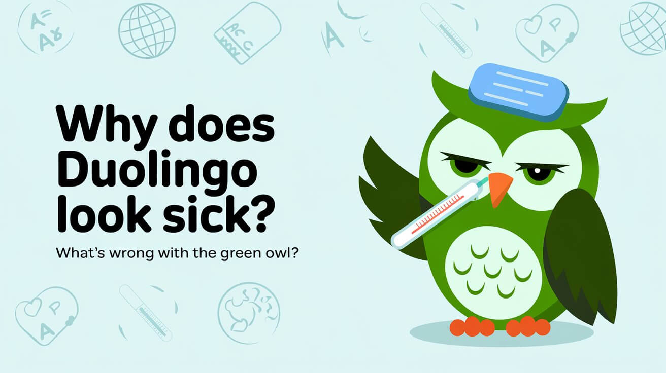
Duolingo’s app icon has changed a few times before. But the latest change, with Duo looking sick, really caught people’s attention. The new Duo has snot, a droopy eye, and looks sweaty and distorted. It’s meant to remind users to keep up with their language lessons.
User Reactions to Sick Duo
When Duolingo introduced the sick bird, people had mixed reactions. Some found it funny and creative. Others thought it was gross, annoying, or even scary. These opinions sparked lots of conversations on social media.
Marketing Impact and Social Media Buzz
Duolingo’s choice to make Duo sick was a smart marketing move. It got a lot of people talking on social media. This buzz likely led to more people downloading the app to see what all the fuss was about.
In short, Duolingo’s bold move to make its mascot sick was a success. It got more people engaged and talking about the app. This shows how important a strong brand and creative marketing can be in language learning apps.
Why Does Duolingo Look Sick
Duolingo, a well-known language app, has a mascot named Duo the green owl. Duo has been seen looking quite sick lately. This is a clever move by Duolingo to keep users interested and practicing their language skills.
Duo’s sick look includes a droopy eye, sweaty face, and a dripping nose. This look is temporary and used to remind users to keep practicing. A Duolingo spokesperson joked that Duo is “sick of reminding everyone to do their lessons.”
Changing Duo’s icon to a sick version has worked well. Users see the owl’s face change, which makes them curious. Duolingo has made many changes to its icon, like being on fire or melting. These changes keep users interested and practicing more.
Duolingo changes Duo’s look to keep users engaged. By showing different emotions, the app connects with its users. This helps users stay committed to learning new languages.
Evolution of Duo’s Visual Identity
Duolingo, a top language-learning app, has made Duo its main visual identity. The owl mascot, known as “Duo,” has changed over time. Each update aims to boost user interaction and strengthen the brand.
History of Duolingo’s Mascot Design
Duolingo picked an owl for its mascot because owls represent knowledge and wisdom. These qualities match the app’s goal of teaching new languages. Since 2011, Duo has become a favorite, helping the brand with its app design strategies and brand marketing through mascots.
Previous Icon Transformations
The Duolingo icon has changed three times, keeping users interested and curious. These updates are part of Duolingo’s plan to keep users engaged and interested in the duolingo mascot appearance. For instance, the owl was shown “on fire” to highlight long learning streaks. At one point, the character looked worried to motivate users to take lessons.
Psychology Behind Mascot Changes
Duolingo’s mascot changes tap into users’ emotional bond with Duo and their drive to keep learning. These updates play on curiosity, rewarding users for staying active and building a connection with the brand’s look. This strategy has worked well, making Duo a meme and a key part of Duolingo’s social media.
| Metric | Value |
|---|---|
| Monthly Active Users | 103.6 million |
| Daily Active Users | 37 million |
| Duo’s Instagram Followers | 3 million |
| Duo’s TikTok Followers | 13.4 million |
App Icon Customization Options
Duolingo, a top language learning app, lets users change their app icon. This move fits with the app’s app design strategies and gamification in language apps. It’s great for both Duolingo fans and those who love making things their own.
For Duolingo’s premium users, like Super Duolingo or Duolingo Max subscribers, changing the app icon is a big plus. They can make Duo the Owl their own, showing off their language learning journey in the app they use every day.
But there’s more. Duolingo gives special “Streak Society” icons to users who hit streak milestones. These icons show off a user’s hard work and add fun to learning languages. They make the app more engaging and keep users coming back.
| Customization Option | Requirement |
|---|---|
| Super Duolingo/Duolingo Max Icons | Subscription to premium tiers |
| Streak Society Icons | Achieving specific streak milestones |
Duolingo lets users make their app their own. This makes users feel like they own the app and want to show who they are. This approach, based on app design strategies and gamification in language apps, keeps users excited and loyal to Duolingo.
Common Queries
Why did Duolingo change its app icon to a sick-looking owl?
Duolingo changed its app icon to a sick-looking Duo the Owl. This was a marketing move to get users more involved. It also reminded them to keep up with their language learning.
How did users react to the sick Duo icon?
The sick owl icon got a lot of attention on social media. People had different reactions, from laughing to being confused. Some thought it was a funny punishment, while others found it creative.
What was the impact of the sick Duo icon on Duolingo’s marketing?
The sick owl icon worked well for Duolingo’s marketing. It made users click on the app to figure out what was going on. This showed Duolingo’s creative ways to keep users interested in learning languages.
Why did Duolingo choose an owl as its mascot?
Duolingo picked an owl because owls stand for knowledge and wisdom. These values match what the app aims to teach.
Has Duolingo changed its app icon before?
Yes, Duolingo has changed its app icon three times before. These changes are part of their plan to keep users curious and engaged.
Can users customize the Duolingo app icon?
Yes, Duolingo lets some users change their app icon. This includes Super Duolingo or Duolingo Max subscribers, and those who hit certain streak milestones.
Wrapping Up
Duolingo’s choice to make Duo look sick has caused a lot of talk among users. This move has brought more attention and interaction, showing Duolingo’s dedication to new ideas. It keeps users excited about learning new languages.
Some people found the sick Duo funny and relatable. Others were confused or upset by the change. But Duolingo has kept the mystery alive, making everyone curious about Duo’s return. This shows the company’s grasp of how mascot design affects user interest in the language learning apps world.
As Duolingo keeps improving its brand persona and app mascot psychology, it will stay ahead in language learning. Its creative marketing and strong connection with users make it a top choice in the language learning apps field.


