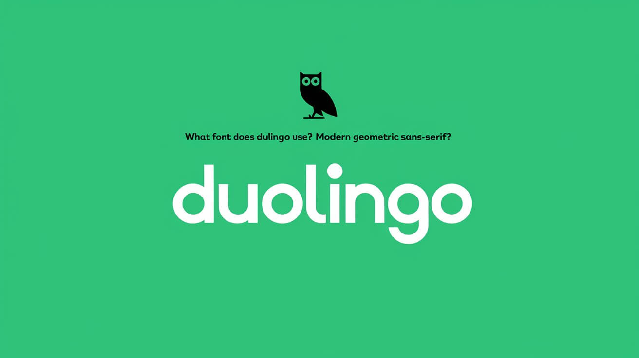
Duolingo, a popular language learning app, utilizes a unique font that plays a crucial role in defining its brand identity and enhancing its user experience. The font, named Feather, is part of Duolingo’s visual language. It makes the app’s design consistent, making it a big part of the app’s look.
This unique font helps Duolingo feel friendly and welcoming. It sets the app apart from others in the educational field.
The font, inspired by Duo the Owl, adds a playful touch. Open Sans, the main text font, is easy to read. Together, they make learning languages fun and clear for everyone.
This mix of fonts supports learning in many languages. It also includes important symbols for users worldwide. The Duolingo font is essential for the app’s design.
Official Duolingo Typography
Duolingo’s typography is key to its brand identity. It plays a big role in making the learning experience better. The design of Duolingo’s font was a team effort with Johnson Banks and Fontsmith. They created a unique typeface that shows off the brand’s personality.
This custom typography is a big part of Duolingo’s brand font. It’s used everywhere on the platform. This makes Duolingo’s visual identity clear and memorable.
The main font, Feather Bold, is for headlines and the Duolingo name. Din Next Rounded is the secondary font. Nunito is used too, because it looks similar to the main font. These fonts work together to make learning a language fun and engaging.
Primary Brand Font
The primary brand font is special and designed just for Duolingo. It’s used all over the platform, in headlines and logos. This custom font makes Duolingo stand out and helps build a strong brand.
Secondary Font Choices
Duolingo also has secondary fonts to make reading easier and more fun. Din Next Rounded and Nunito are these fonts. They are chosen to match the Duolingo brand and support the learning design.
Custom Typography Elements
Duolingo’s custom typography makes learning languages fun and unique. It sets Duolingo apart from other platforms. By using custom fonts, Duolingo creates a special visual language that supports its mission.
Evolution of Duolingo’s Visual Language
Duolingo’s visual language has changed a lot over time. This change shows how the company has grown and improved its design. The use of a special font is a big part of this change. It shows the fun and learning spirit of Duolingo.
Designing Duolingo involved working with experts like Johnson Banks. They helped make Duolingo’s brand even stronger. You can see this in the app’s bright colors, soft buttons, and simple art. These features make Duolingo more fun and easy to recognize.
Some important parts of Duolingo’s look include:
- Optimized illustrations for easy reading, using just enough detail
- Using white space to make things easier to see, even on small screens
- Adding humor to make learning fun and reduce fear of mistakes
These features have made Duolingo’s visual style unique. It shows the company’s growth and focus on design. By always improving its look, Duolingo has become a more engaging and recognizable brand. This shows its dedication to providing a top-notch language learning experience.
Technical Specifications of Duolingo’s Font Family
Duolingo’s font family is made for a smooth experience on different devices. Its technical details make it versatile and easy to use. It supports many languages, perfect for language learners.
The font family has various weights and a full character set. These features help it work well for many languages. This makes Duolingo’s typography great for learning new languages.
Font Weight Variations
Duolingo’s font family has weights from light to bold. This makes headings clear and body text easy to read. It helps users move around the platform smoothly.
Character Set Details
Font family supports many languages. It has a full character set. This means users can see the platform in their own language.
Display Properties
Duolingo’s font family looks good on all devices. It’s designed for easy reading and use. This makes using the platform simple for everyone.
Brand Identity Through Typography
Duolingo’s custom typography makes it instantly recognizable. Branding experts say using consistent elements like typography can boost brand identity by up to 70%. This shows how vital typography is in building a strong brand.
Good typography can also make things easier to read, improving comprehension by up to 20%. About 65% of people learn better through visuals, highlighting the role of typography in digital branding. A clear typographic hierarchy ensures text is readable, making it key for accessibility and engagement.
Some key considerations for brand identity through typography include:
- Using a few typefaces to keep the look clean and consistent
- Choosing legible and modern fonts that improve user experience
- Keeping typography consistent across all platforms to boost brand recognition
Following these tips, companies like Duolingo can create a strong visual identity. This identity helps build trust and loyalty with their audience.
Font Implementation Across Platforms
Keeping fonts consistent is key for a brand’s look. Duolingo uses the same fonts everywhere, like on its app, website, and ads. This makes the brand easy to spot and remember.
Choosing the right fonts for different places needs careful thought. Duolingo’s fonts work well on phones, websites, and ads. This makes sure the brand looks the same everywhere, creating a smooth experience for users.
Mobile App Typography
The app’s fonts are easy to read, even on small screens. Duolingo picked fonts that work well on phones. This makes the app’s content clear and fun to use.
Website Font Usage
The website uses the same fonts as the app. This makes switching between devices easy. It keeps the brand’s look consistent, no matter where you are.
Marketing Material Fonts
Ads and social media posts also use Duolingo’s fonts. This keeps the brand’s message strong and clear. It makes sure the brand is recognized, even in different settings.
Duolingo’s consistent font use makes its brand easy to recognize. This helps create a smooth experience for users. It also makes sure the brand’s message is clear and strong.
| Platform | Font Implementation | Typography Consistency |
|---|---|---|
| Mobile App | Optimized for small screens | Consistent with website and marketing materials |
| Website | Consistent with mobile app | Consistent with mobile app and marketing materials |
| Marketing Materials | Consistent with mobile app and website | Consistent with mobile app and website |
Color and Typography Harmony
Duolingo’s brand is built on a special color palette and custom typography. This mix creates a visually appealing and engaging interface. The use of a triadic color scheme, with green as the main color and orange and blue as supports, boosts user interaction and navigation. This color scheme is a key part of Duolingo’s visual design, working well with its typography to make a cohesive brand identity.
The choice of fonts also affects the typography harmony. Simple, clean fonts like Arial or Verdana are recommended for their high legibility. Studies show that certain fonts can make readers feel more relaxed. A well-chosen typeface can connect better with users, and using the same typography across UI elements can strengthen the brand identity and improve the user experience.
Some key considerations for achieving color and typography harmony include:
- Using a triadic color scheme to create a visually balanced design
- Selecting fonts that are highly legible and suitable for the target audience
- Ensuring consistent typography usage across UI elements
- Choosing a color palette that complements the typography and enhances user engagement
Considering these factors, Duolingo has made a visual design that is both beautiful and effective. The harmony between color and typography is vital to the platform’s visual design. It plays a big role in making the user interface engaging and interactive.
Typography’s Role in Language Learning
Typography is key in language learning, making it both effective and fun. The right typeface can greatly improve how easy it is to read. Duolingo’s custom typeface, Feather, is simple and engaging, making learning a language enjoyable.
App uses Open Sans for body text, a font known for being easy to read. This font is friendly and perfect for learning languages. Together, Feather and Open Sans appeal to millions, showing the app’s wide reach.
Readability Factors
Readability is vital in language learning, and Duolingo focuses on it. Each character is carefully made with plenty of space and clear edges. This makes learning languages easier and more comfortable.
Cross-Language Support
Duolingo’s font system handles many language variations well. It supports multiple languages, making it great for learners. This is helpful for those learning languages with special characters and accents.
| Font | Description |
|---|---|
| Feather | Custom typeface designed to be simple and engaging |
| Open Sans | Humanist sans-serif font known for its exceptional readability and friendly appearance |
Typography is very important in language learning. Duolingo’s custom typography supports learners by making reading easy and supporting many languages. The mix of Feather and Open Sans makes learning fun and accessible for millions.
Font Accessibility Standards
Design standards are key for font accessibility, making sure everyone can use Duolingo. The Web Content Accessibility Guidelines (WCAG) have three levels. Level 1 has about 30 items, Level 2 adds 20, and Level 3 has 28 more.
Choosing the right font is important. It should not be too small or too big. It’s best to use only 1 or 2 fonts per course. Standard fonts are better than decorative ones.
The design should not just use color to communicate. It must include alt text for images and captions for videos. For example, the WCAG requires a text contrast ratio of at least 4.5:1 for normal text and 7:1 for large text.
Some important points for font accessibility are:
- Avoiding overly small or large font sizes
- Limiting fonts to 1 or 2 per course
- Using standard fonts while eschewing decorative types
- Ensuring a minimum contrast ratio of 4.5:1 for normal text and 3:1 for large text
Following these standards, Duolingo makes sure everyone can use it, no matter their abilities. This focus on accessibility is a big part of Duolingo’s design. It helps make the platform great for all users.
Conclusion
Duolingo’s custom typography is more than just a design element. It’s a key part of the platform’s brand and learning experience. The platform’s typography has grown to fit perfectly with its visual style and mission.
The heart of Duolingo’s typographic identity is its primary font. This font is playful yet easy to read. It shows the platform’s friendly and approachable side. The use of different font weights and character sets makes reading better, which is key for a language learning app.
Duolingo’s typography is used everywhere, from the app to the website and marketing. This makes sure the brand looks the same everywhere. Typography plays a big role in making Duolingo’s brand strong and engaging for users.
Duolingo’s custom typography shows how design can shape a brand and user experience. Duolingo’s font choices have made a unique visual language. This language not only shows its educational mission but also connects with users worldwide, making learning languages fun and easy.
