The Duolingo icon has changed a lot, with the newest design being a sick owl. This might seem strange, but it’s part of Duolingo’s plan to keep users interested. The Duolingo icon is now a big part of learning languages, and its new look has caught everyone’s attention.
Duolingo icon is very important for how users interact with the app. Its latest design, the sick owl, is meant to get users excited about learning. Duolingo wants to encourage users to keep up with their lessons and keep their streaks going.
Brand Evolution of Duolingo’s Mascot
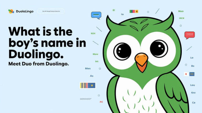
Duolingo’s mascot, Duo, has seen many changes. The original was a bright, friendly green owl. Now, Duo is a key part of Duolingo, showing the app’s focus on making learning fun and personal.
Duo’s evolution shows how Duolingo has grown and changed to meet user needs. With over 103.6 million monthly users, Duolingo uses Duo to make learning feel more like a personal journey. Users can even customize their icons and interact with Duo in different ways.
Original Design Origins
The first Duo was simple yet effective. The bright green owl was meant to be welcoming, encouraging users to start learning new languages. As Duolingo grew, so did Duo, adding new features and emotions to show the user’s progress.
Previous Icon Iterations
Duolingo has introduced many new icons, like the “melting owl” and holiday designs. These updates have led to lots of social media buzz, showing users are really engaged. Users can even pick their own icons, like the orange Duo with burning eyes for Streak Society members.
| Icon Iteration | Description |
|---|---|
| Melting Owl | Limited-time change to encourage users to update the app and boost engagement |
| Holiday Editions | Temporary design changes to engage users more frequently |
| Customizable Icons | Personalized experience for users, with options like the orange Duo icon with burning eyes |
Design Philosophy Changes
The design of Duo has always aimed to make learning fun and engaging. By adding new emotions and features, Duolingo keeps users interested, even if they haven’t used the app in a while. Duo’s evolution shows Duolingo’s dedication to making learning a personal and enjoyable experience.
What Happened to the Duolingo Icon
Duolingo recently changed its icon to a sick owl. This might seem strange, but it’s part of their plan to keep users interested. They want to make users curious and encourage them to use the app more.
This change is not random. It’s a smart move to get more people involved. With over 103.6 million monthly users, Duolingo is always looking for ways to keep things fresh. The new owl icon is just one way they’re doing this.
- A sick owl design that reflects the user’s progress and inactivity
- A customizable icon for premium users through Duolingo Super and Duolingo Max
- Special icon customization for members of the Streak Society
Goal is to keep users coming back. A new icon sparks excitement and curiosity. This can lead to more people using the app. With a big user base and lots of marketing, Duolingo is set to grow even more.
Major Visual Modifications
Latest update to the Duolingo icon has brought big changes. It now has a new color scheme and a different character expression. The design is more subdued, with blues and grays, fitting the design philosophy.
This update is part of a bigger effort to make the app more engaging. It aims to improve how users interact with the app.
The sick owl icon was introduced in August 2024. It shows how users feel when they’re frustrated or demotivated. This is a normal part of learning.
Before the sick owl, there were other icons like the melting owl and the exhausted owl. They were introduced in October 2023 and April 2024. These icons have made the app more interesting and have increased user interaction.
Color Palette Shifts
The new color palette is calmer, with blues and grays. This change aims to make learning easier for users who find it hard.
Character Expression Updates
The owl now looks more tired and exhausted. This change is part of a plan to keep users interested and loyal. The owl’s new look makes the app more fun and engaging.
Dimensional Adjustments
The icon’s design has also been improved. It’s now more detailed and textured. These changes make the icon more appealing and interactive.
The updates have made the Duolingo icon better. It’s now more engaging and effective in creating a positive experience. The temporary designs have also made the app more popular on social media.
| Icon Version | Introduction Date | Character Expression | Color Palette |
|---|---|---|---|
| Original Duo | 2012 | Flat, geometric owl design | Bright green |
| Melting Owl | October 2023 | Melted face | Blues and grays |
| Exhausted Owl | April 2024 | Tired and exhausted | Blues and grays |
| Sick Owl | August 2024 | Tired and demotivated | Blues and grays |
Technical Specifications of the New Design
The new Duolingo icon design is all about simplicity and elegance. It uses a bright color palette and works well on both mobile and desktop devices. This design makes it easy for users to find their way around the app.
Some key features of the new design include:
- A unique technical specification that prioritizes simplicity and elegance
- Optimization for various platforms, including mobile and desktop devices
- A bright color palette that retains the app’s original aesthetic
New design also has a melting icon feature. This is a fun way to keep users engaged. It’s only seen by those with the latest Duolingo app. This feature adds a surprise to the app, making it more fun and interactive.
| Feature | Description |
|---|---|
| Technical Specifications | Unique set of technical specifications focusing on simplicity and elegance |
| New Design | Optimized for various platforms, including mobile and desktop devices |
| Melting Icon Feature | Temporary engagement strategy designed to encourage app interaction |
Brand Identity Impact
Duolingo’s new icon has caused a stir among users. Some love it, while others don’t. This change has greatly affected the company’s brand identity. It shows Duolingo’s goal to make learning languages easy for everyone.
The app’s logo has changed several times to keep up with trends and user needs. The owl in the logo means wisdom and learning. It aims to welcome learners of all ages. The green color stands out and symbolizes growth and energy.
Market Positioning
Duolingo wants to make learning languages fun and easy. Its unique approach has made it popular. But, the new icon has made some question its focus on user experience.
Target Audience Reception
Users have mixed feelings about the new icon. Some like its modern look, while others miss the old charm. The logo’s friendly design helps build trust with users, which is key for learning apps.
Community Feedback
Users have shared their thoughts on social media about the new icon. It has sparked a big conversation about Duolingo’s brand and market position. Even with mixed opinions, the change has brought more attention to the app.
Platform-Specific Variations
The Duolingo icon change is available on both mobile and desktop devices. This ensures a smooth experience for all users. Each device has its own design, tailored to enhance the user experience.
These variations make it easy for users to find their way around the app. They help keep the app consistent and easy to use, no matter the device.
Here are some key features of these variations:
- Mobile devices: The icon change is made for smaller screens. It focuses on simplicity and ease of use.
- Desktop devices: The icon change is designed for larger screens. It offers more detailed information and features.
The app’s layout and navigation also change with the platform. For example, the mobile app has a bottom menu for quick access. The desktop app has a more detailed menu with extra options. These changes make the app consistent and easy to use on any device.
| Platform | Icon Change Features |
|---|---|
| Mobile | Optimized for smaller screens, simplified navigation |
| Desktop | Optimized for larger screens, more detailed information and features |
Duolingo’s icon change is tailored for each platform. This ensures a seamless and intuitive experience for users. Whether on a mobile or desktop device, users can easily navigate and engage with the app.
Social Media Response Analysis
Duolingo’s new icon has caused a big stir on social media. People are sharing their thoughts and making memes. Some love the new look, while others miss the old one. Duolingo has over 12.5 million followers on TikTok, and their videos get millions of views.
Twitter and Instagram are full of opinions on the new icon. Some users are excited, while others are sad about the change. Duolingo’s team has also joined in, making a funny video called “Duo Push” to promote the new design.
User Engagement
The new icon has made people more active on social media. Users are creating memes and sharing their thoughts. This has brought Duolingo’s community closer together.
The feedback from users is helping Duolingo improve. They can see what people like and what they don’t. This helps them make better decisions for the app’s design and marketing.
| Platform | Followers | Engagement |
|---|---|---|
| TikTok | 12.5 million | Millions of views per video |
| 3.2 million | High engagement rates | |
| 2.5 million | Active user discussions |
Design Strategy Behind Changes
The Duolingo icon change is a big move to update the brand’s look and get people talking. It’s part of Duolingo’s plan to meet marketing goals and improve user experience. By introducing new icons, Duolingo wants to get users excited and explore more of the app.
With over 74 million active users in 2024, Duolingo’s design strategy is key to keeping users interested and growing. The app keeps up with the times by updating often. Over 50% of these updates come from A/B testing, making sure the design meets user needs.
Marketing Goals
Duolingo aims to keep users engaged and coming back. The new icons, like the melting Duo, have sparked a lot of buzz on social media. Duolingo also uses gamified elements like XP and streaks to keep users motivated.
User Experience Considerations
The icon change is also about making the app better for users. Duolingo’s notifications have led to a 5% increase in daily users. The app tracks how users respond to notifications, making them more personal and effective.
Key parts of Duolingo’s design strategy include:
- Regular updates and A/B testing to inform design decisions
- Introduction of new icons and gamified elements to drive engagement
- Personalized notification strategy to enhance user experience
| Year | Design Update | Impact |
|---|---|---|
| 2011 | Minimalist text-based logo | Established brand identity |
| 2014 | Introduction of green owl mascot | Increased brand recognition |
| 2019 | Modernized UI with sleeker Duo icon | Improved usability and design trends |
| 2024 | Introduction of experimental icons | Driven social media buzz and engagement |
App Performance Effects
The new Duolingo icon has had a small effect on the app’s performance. Some users have noticed minor issues. But the design is optimized for all platforms, making the app smooth to use.
The changes to the icon have been watched closely. It’s clear that the new look doesn’t affect how the app works. It’s just a cosmetic update.
Here are some important stats about the app’s performance:
- There are about 200 screens in the app, all updated for the new design.
- More lessons are being taken after the redesign, showing users like the new look.
- More people are subscribing to Duolingo Plus after the redesign, showing they like the new design.
The app’s performance remains strong despite the new design. The icon change has had a small impact, but the app works as well as ever. The new design ensures a smooth experience for users.
| Statistic | Value |
|---|---|
| Monthly active users | 103.6 million |
| Daily active users | 37 million |
| Retention rate improvement | 35% |
Conclusion
The new Duolingo icon has started a big conversation among users. Some like the sleek, new look, while others miss the old design. But, this shows how small changes can really affect a brand and how people interact with it.
It will be interesting to see how the new icon helps Duolingo grow. The melting effect might make users open the app more often. Also, the options for Super Duolingo and Duolingo Max subscribers show Duolingo’s effort to make the app fit each user’s taste.
Change in Duolingo’s icon has really caught people’s attention. Users are sharing their thoughts on social media. This shows how much people love Duolingo and are excited to see what’s next for the app.
FAQs
What has happened to the Duolingo icon?
The Duolingo icon has changed, now featuring a sick-looking owl. This change aims to keep users interested and curious.
Why did Duolingo change its iconic owl mascot?
Duolingo updated its owl mascot, Duo, to keep users engaged. The changes show the app’s dedication to emotional connection.
What are the visual modifications in the new Duolingo icon?
The new icon has a calmer color scheme, with blues and grays. It also shows a tired owl expression.
How does the new Duolingo icon design perform on different platforms?
The new icon looks great on all devices, like phones and computers. It’s simple and elegant for a smooth user experience.
How has the Duolingo icon change impacted the brand’s identity and market positioning?
The change has made a big impact on Duolingo’s brand. Some like the new look, while others don’t. It has also raised questions about the app’s focus on user engagement.
What has been the social media response to the Duolingo icon change?
Social media is buzzing with opinions on the new icon. People are sharing their thoughts and making memes. Some praise the creativity, while others are upset by the change.
What is the design strategy behind the Duolingo icon change?
Change is part of Duolingo’s plan to keep users interested. The new design aims to spark curiosity and encourage users to come back.
How has the Duolingo icon change affected the app’s performance?
The change has had little effect on the app’s performance. Some users noticed small issues, but the design works well on all devices.


