Duolingo, a well-known language app, has made a big change. Its mascot, Duo the Owl, now looks sick. Duo has a runny beak, droopy eyelid, and looks sweaty. This has made many users wonder about Duo’s health.
Duo, the green owl, has changed looks before. But this new sick look has really caught people’s attention. Duolingo says this change is to get users more involved with the app.
Some might be surprised by Duo’s illness. But Duolingo says it’s just a marketing trick. They claim it’s not a real health issue. Instead, it’s meant to keep users learning and using the app.
Users React to Duo’s Sudden Health Decline
Duo, the beloved Duolingo mascot, fell ill unexpectedly. This sudden sickness caused a stir among the app’s users. People on social media were both amused and concerned by Duo’s new look.
Social Media Concerns About Duo’s Appearance
Many users took to social media to talk about Duo’s new look. On X (formerly Twitter), some joked that Duo needed a doctor. Others were confused and not amused by the change.
On Reddit, some thought Duo’s new look was a “punishment” for missing lessons. Some found it “gross” or “traumatizing.”
Community Response to Sick Mascot
The Duolingo community had mixed reactions to Duo’s sickness. Some found it funny and creative, while others were deeply upset. A few even deleted the app because they couldn’t get used to Duo’s new look.
| Platform | User Reactions | Timestamp |
|---|---|---|
| X (formerly Twitter) | Suggestions for Duo to seek medical attention, confusion over the change | July 3, 2022 |
| Belief that the icon update was a “punishment” for missed lessons, finding the new look “gross” or “traumatizing” | July 4-5, 2022 | |
| Duolingo App | Some users found the changes entertaining and creative, while others deleted the app due to distress over Duo’s new appearance | July 6, 2022 |
Marketing Strategy Behind Duo’s Illness
Duolingo, a top gamified education platform, has made a bold marketing move. It changed its iconic app icon, Duo the owl, to look sick. This change is part of Duolingo’s plan to get users more involved and active on the app.
A Duolingo spokesperson said the goal is to “remind everyone to do their lessons.” This isn’t the first time Duolingo has changed its icon to send a message. Before, it used icon changes to show off streaks or the need to finish lessons.
The idea is to get users to open the app and keep up with their learning. By making Duo look distressed, Duolingo uses app icon anthropomorphism to engage users. The new looks, like Duo melting or looking old and sad, have started big conversations online.
Duolingo keeps trying new ways to keep users excited and motivated. Its efforts show the company’s commitment to building a lively community for learning languages. It will be interesting to see how Duo’s new look and other changes affect how people use the app.
Symptoms and Changes in Duo’s Appearance
In recent months, the beloved Duolingo owl, Duo, has shown concerning symptoms. This has caused a stir in the digital language learning community. Duo has been diagnosed with bird flu, leading to changes in the app icon’s look.
Visual Changes to App Icon
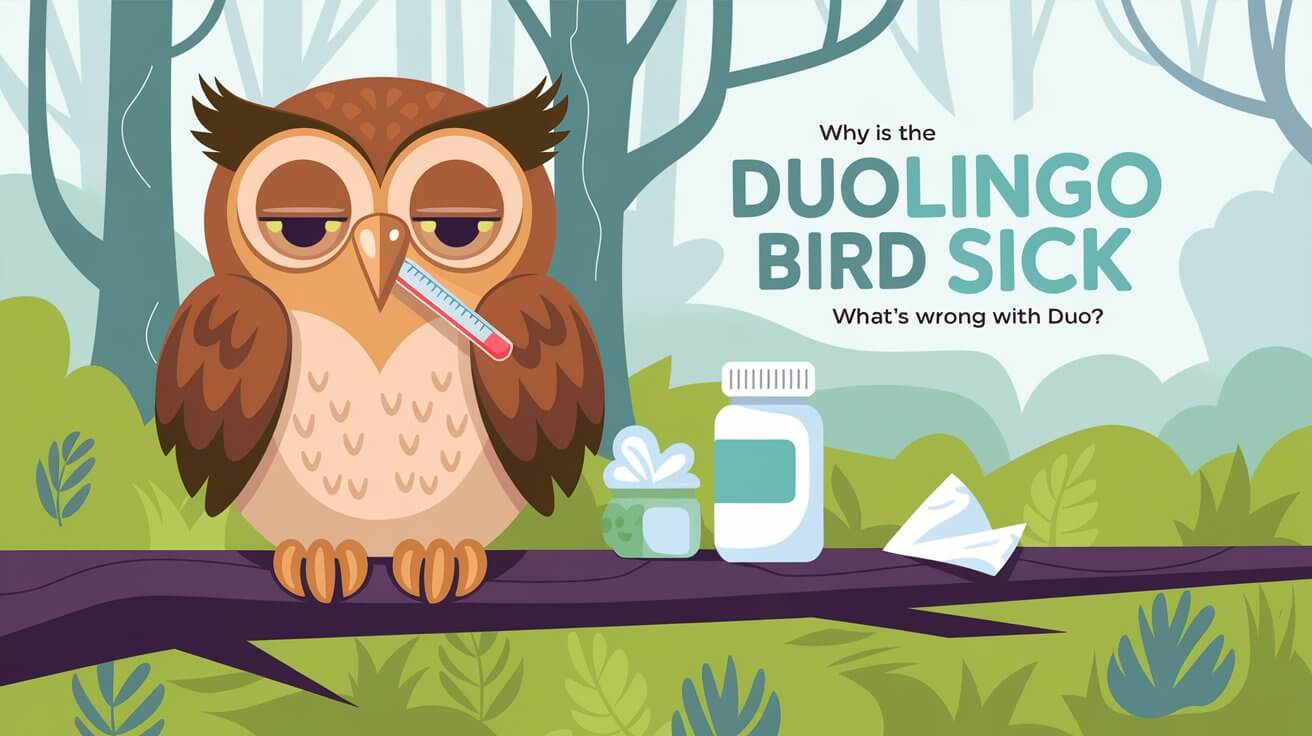
Duo’s illness is evident in the app icon. A dripping snot from his beak is a clear sign of his health issues. His left eyelid droops, and his face looks flushed and sweaty, like he has a fever.
Physical Signs of Duo’s Bird Flu
The company shared a video on social media showing Duo’s symptoms. The video shows Duo’s appearance worsening, with users comparing it to “the bubonic plague.” Despite these changes, Duo looks healthy in the app, which has caught the attention of the Duolingo community.
| Symptom | Description | Timeline |
|---|---|---|
| Drooping eyelid | Duo’s left eyelid appears to be drooping, indicating a potential eye infection or inflammation. | Observed in April of a certain year |
| Sweaty, melting face | Duo’s face has a flushed, sweaty appearance, as if he’s burning up with a fever. | Reported in October of the previous year |
| Dripping snot | A clear, viscous liquid is seen dripping from Duo’s beak, a classic symptom of the avian flu. | Ongoing since the initial appearance changes |
The Duolingo team has taken a quirky approach to marketing. They use Duo’s illness to engage with users and add novelty to the app’s branding. It will be interesting to see how the community reacts to these updates.
History of Duolingo’s App Icon Changes
Duolingo, a well-known language learning app, has changed its app icon many times. The owl, its mascot, stands for knowledge and wisdom. These changes often show how active users are or highlight the app itself.
Previous Icon Transformations
Duolingo has updated its icon to keep things fresh and fun for users. In 2020, the app icon showed Duo, the mascot, in a fun, animated way. This showed the app’s interactive and game-like learning experience. These updates not only made the app look new but also showed it was always improving for users.
Evolution of Duo’s Design
- In October 2023, Duolingo’s app icon changed again. Duo looked like it was “melting.” This was to get users to update to the latest version, which had big design changes.
- The melting Duo logo was a clear sign of the updates and improvements to the language learning app characters and edutainment software design.
- Duolingo’s dynamic icon changes show its commitment to staying interesting and useful for its users. It makes sure the app remains a valuable and easy-to-use tool for learning languages.
As Duolingo keeps growing, its look will likely change too. This shows the company’s ongoing effort to offer the best language learning app characters and edutainment software design experience.
Impact on User Engagement and App Usage
Duolingo’s choice to change Duo the Owl’s look has really affected how people use the app. This change used a trick called the novelty effect to get users more involved. It worked well in making people want to use the app more.
User Behavior Changes
Many Duolingo users now open the app just to see how Duo is doing. They also want to find out what other fun surprises are waiting for them. This curiosity has made people spend more time on the app, checking out the new updates.
People talking about Duo’s “illness” on TikTok and Reddit has also helped make the brand more popular. It’s made users even more interested in what’s happening with Duo.
Platform Interaction Trends
Duolingo’s use of games and guilt-tripping in its notifications has really worked. Even though some people don’t like it, it’s made users more likely to use the app. This is better than other ways to get people to come back.
The company has also started using TikTok, which has over 12.5 million followers. This has helped Duolingo reach and keep the attention of its young users. It’s made the app even more popular.
Frequently Asked Questions
What happened to the Duolingo mascot, Duo the owl?
Duo the owl, Duolingo’s mascot, has a new look. The app icon now shows Duo with a snotty beak and a droopy eyelid. Duo looks sweaty and feverish, like it has bird flu.
Why did Duolingo change Duo’s appearance?
Duolingo changed Duo’s look to get more people using the app. They said Duo is tired of reminding everyone to do their lessons. The new look is meant to get users to open the app and keep up with their lessons.
Is Duo’s illness contagious to users?
No, Duo’s bird flu won’t spread to users. Duolingo joked that Duo is sick, but it’s not a real risk to users. It’s all just a fun marketing trick.
How have users reacted to Duo’s new appearance?
People have mixed feelings about Duo’s new look. Some find it funny and creative. Others are confused or upset. Some think Duo needs help, while others see it as a lesson reminder.
Some users find it too gross and have deleted the app. But many are talking about it online, which might help Duolingo get more attention.
What are the visual changes to Duo’s appearance in the app icon?
Duo’s new look has snot dripping from its beak and a red, droopy eyelid. Its face looks sweaty and feverish. These changes are only on the app icon, not inside the app where Duo looks normal.
Has Duolingo changed its app icon before?
Yes, Duolingo has changed its icon three times before. They use new icons to show user activity or to get people’s attention.
What is the impact of Duo’s illness on user engagement and app usage?
The sick Duo icon is meant to remind users to take their daily lessons. It’s working, as some users are checking the app to see how Duo is doing. This has sparked a lot of online talk, which might help Duolingo.
But, some users are unhappy and have deleted the app. They find the new icon too gross. Still, the buzz around Duo’s illness could help Duolingo attract more users.


