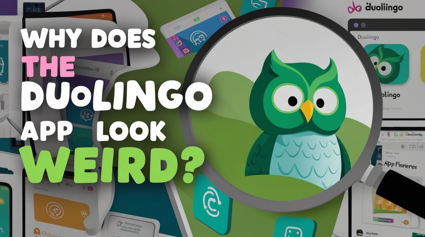
Duolingo’s iconic green owl mascot has changed, leaving many users confused. Let’s unpack why the app looks different now and how you can tweak its appearance. We’ll examine the company’s reasons for the update and show you ways to adjust the app’s look to suit your taste.
Duolingo App’s Visual Transformations
The Duolingo app may take on a different appearance for several reasons, including logo updates, A/B testing, and layout changes.
Logo Changes
The Duolingo website explains that the logo may change as the developers work to fix bugs and improve the overall app experience. Some users have speculated that these logo updates are also a way to encourage users to update their app to the latest version. For instance, in April 2024, some Duolingo users noticed that the app icon had become wrinkly and somber, which was thought to be an attempt to grab users’ attention and motivate them to complete their daily language lessons.
A/B Testing
Duolingo may also experiment with the app’s appearance as part of an A/B testing process. In this procedure, the company divides learners into groups and provides one group with the new version of the app while the other group receives the old version. This allows Duolingo to gauge user reactions and preferences before rolling out any major changes.
Layout Changes
Duolingo may also update the app’s layout to enhance the learning experience. For example, in 2024, the company revamped the home screen with a simplified learning path to help learners who were struggling to decide whether to complete a skill or switch between different skills.
The Reason Behind Duolingo’s Melting and Sad Icon
One of the more recent and notable visual changes to the Duolingo app has been the introduction of a “melting” icon and a “sad, old” version of the app’s mascot, Duo the owl.
The Novelty Effect and User Engagement
These unusual icon updates are part of Duolingo’s strategy to leverage the “novelty effect” and boost user engagement. The company explained that the melting and sad Duo icons are designed to encourage users to open the app and interact with the latest version.
New and unexpected visual stimuli can temporarily increase a user’s motivation and interest. By shaking up the familiar Duolingo brand, the company aims to capture users’ attention and prompt them to explore the app’s features and content.
Duolingo’s Past Icon Experiments
This isn’t the first time Duolingo has experimented with its app icon. In the past, the company has introduced a “melted face” version of Duo, as well as an icon depicting the mascot in a more distressed or emotional state.
These temporary icon changes are all part of Duolingo’s playful, attention-grabbing approach to marketing and branding. The company isn’t afraid to try unconventional tactics to keep users engaged and curious about the language-learning experience.
Temporary vs. Permanent Icon Changes
The melting Duo icon is a temporary visual change, not a permanent update to Duolingo’s brand. The company says these icon changes aim to prompt users to update their app and check out new features or content.
How to Customize the Duolingo App Icon
If you’re not a fan of the melting or sad Duo icon, you do have the option to change the app’s appearance. The customization options depend on your Duolingo account status.
Options for Super Duolingo and Duolingo Max Users
If you’re a subscriber to Super Duolingo or Duolingo Max, you can swap out the default icon for a special version tied to your membership:
- Open the Duolingo app and go to the home screen.
- Tap the Duo icon in the top right corner.
- Scroll down and select either “Super App Icon” or “Max App Icon.”
- Tap “Turn On” to activate your preferred icon.
Streak Society Members’ Icon Customization
Members of Duolingo’s Streak Society also have the ability to customize the app icon. To do this:
- Tap the streak flame icon at the top of the Duolingo home screen.
- Swipe through to find the Streak Society section.
- Tap “Enter Now” and then select “Change App Icon.”
- You’ll be able to choose from up to three different Duo icon options.
If you ever want to revert to the original melting or sad Duo icon, you can do so by revisiting the icon settings and selecting “Restore Original Icon.”
Maintaining Your Duolingo Streak Amid the Visual Changes
While Duolingo’s app icon may be evolving, the importance of maintaining your language learning streak remains. Here are some tips to help you keep up your Duolingo practice:
Setting Reminders
Take advantage of Duolingo’s push notifications or set your own phone reminders to ensure you complete your daily lessons.
Finding Short Practice Windows
Even just 5-10 minutes per day can be enough to finish a Duolingo lesson and extend your streak.
Celebrating Milestone Achievements
Duolingo provides rewards for streak milestones, so be sure to enjoy unlocking those motivational boosts.
Using Duolingo Alongside Other Resources
Supplement your Duolingo time with podcasts, books, language partners, and other methods for well-rounded skill development.
Avoiding Stress Over Broken Streaks
If you miss a day, simply get back into your routine. Duolingo makes it easy to pick up where you left off. Maintaining a long streak is great, but don’t beat yourself up over a temporary break.
Duolingo’s Creative Approach to Branding and Marketing
Duolingo’s willingness to experiment with its app’s visual identity is just one example of the company’s creative, playful approach to branding and marketing.
The Push Notifier Owl
In the past, Duolingo has employed tactics like the menacing “Push Notifier” owl, which would aggressively prompt users to keep up their daily lessons through humorous notification messages.
Balancing Fun and Functionality
Duolingo’s distinctive marketing voice is all about adding elements of fun, surprise, and delight to the language learning experience. The melting and sad icon updates perfectly exemplify this balance between whimsy and functionality.
Final Thoughts
Duolingo’s app may have some unusual visual transformations, but at the heart of these changes is a strategic effort to keep users engaged, motivated, and excited about language learning.
Whether it’s a melting mascot or a somber-looking owl, Duolingo isn’t afraid to try creative, attention-grabbing tactics to encourage consistent practice and reinvigorate the user experience.
By embracing these evolving aesthetics and customizing the app to your liking, you can continue making progress on your language skills while also enjoying Duolingo’s distinctive brand personality. So don’t be surprised or dismayed by the next visual twist – view it as an opportunity to dive deeper into your language journey and have a little fun along the way.
